CERBERUS CASE STUDY
Cerberus, a healthy energy drink brand, needed another way to expand in a way that can be easily accessible. A website is perfect for this type of branding since everyone already orders online instead of going shopping in-person. This case study explores the process from beginning to end on how the website came to be.
PURPOSE
- Marketing the drinks for 
non-athletic, everyday goals, such as work, studying, or gaming, rather than just sports hydration.
- Nutritional Highlights: Websites provide clear displays of vitamin content, and caffeine levels.
- Health Disclaimers: To address safety concerns and regulatory standards, sites often include warnings that the drinks may not be suitable for children.
GATHERING CONTENT
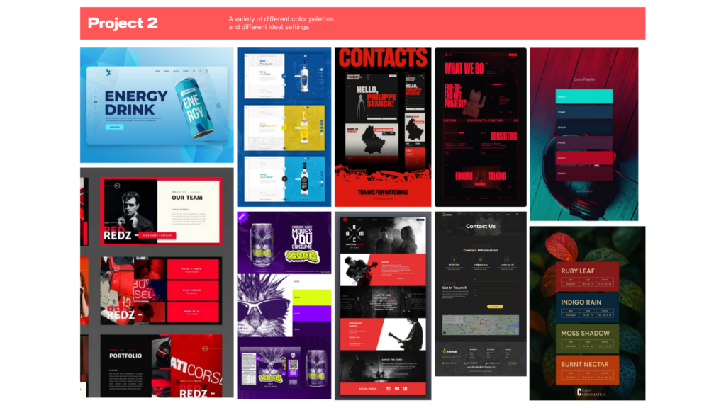
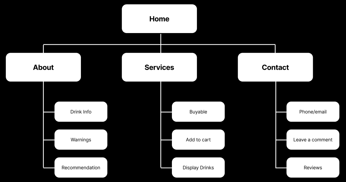
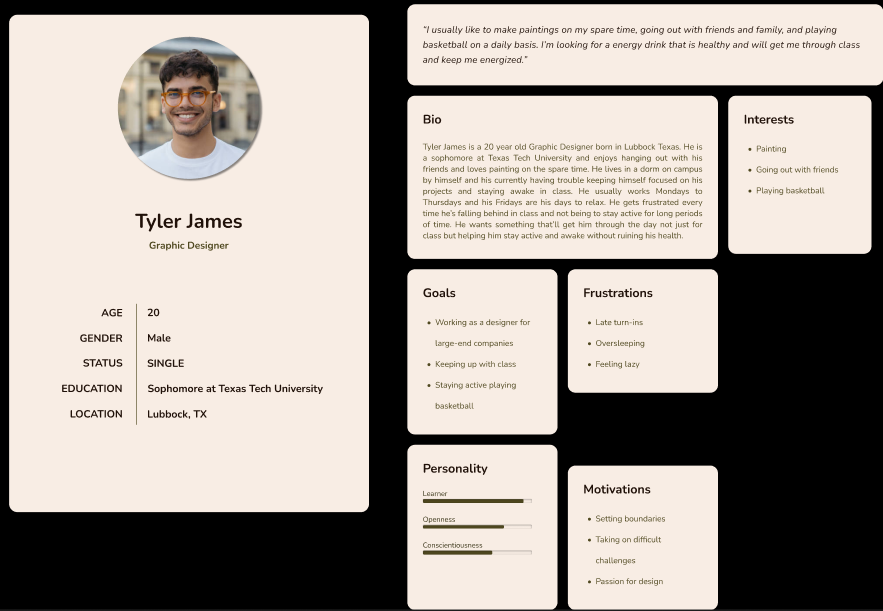
The design process the Cerberus website began with taking a look at how the brand was made, and looking at inspirations when beginning to make mockups of the website. A persona was made to be a representation of the targeted audience for the brand and the best way to design the website. Next, was creating a sitemap to help organize where the information is going to be placed and provide a clear structure of the website. Finally, wireframes were made to display the layout along with having a functional prototype that anyone can look at. The designs and theme of the brand were taken into consideration as the best way to represent the overall look of the website.
SITE MAP
A sitemap was created to be the outline for the website, and to plan out where to put buttons, along with how the website will function from that point on.
PERSONA
The persona is essential to help give an idea of what the targeted audience looks for when buying energy drinks. This makes it a lot easier to plan out the content and what to have for the website.
WIREFRAMES
The wireframes are the plans we use to lay out the blueprint of the website, and pointing out key positions for interactive buttons and making sure the website is easy to navigate.
PROTOTYPE
The wireframes are the plans we use to lay out the blueprint of the website, and pointing out key positions for interactive buttons and making sure the website is easy to navigate.
WORDPRESS SITE
The final version of the website reflects the vision people have when they think of Cerberus. Throughout the website is a clear indicator of what the energy drinks have to offer while being clean with the layouts too.
CONCLUSION
Designing the website was challenging, but fun when coming up with designs and layouts that anyone can easily approach to get a healthy energy drink while the design looks cool and visually pleasing, along with easy navigation. This project, despite being challenging, can teach someone not to judge a book by its cover or, in this case, a website by its looks, and is actually approachable regardless of its theme.